Edward Tufte
The Visual Display of Quantitative Information
Envisioning Information
Visual Explanations
Many brilliant authors write only one book in their entire life.
It gets published over and over again under different titles and with minor
variations in details, but it's basically the same book. When you read
one, you've read them all. Edward R.Tufte is one of those -- except that
the first two volumes only contain two thirds of his wisdom (the same two
thirds), while the third volume covers the other two thirds -- in other
words, about half is redundant, the other half new. To get the whole story,
read either of the first two, and then the third.
This isn't to say his book(s) are a waste of time. His insights are
brilliant and should be read by everybody with information to share. However,
he published them himself, and as always, this leads to some unfortunate
editing problems -- fewer in his case than most, but still there. They
say the man who is his own lawyer has a fool for a client; I suspect that
applies to editors too.
There. You have seen all the negatives. The books are wonderful. Read
one.
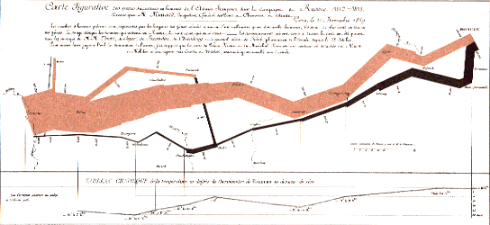 Tufte
is particularly proud of this 19th century drawing by Charles Minard, showing
graphically the losses sustained by Napolean's army as he attempted to
invade Russia. It illustrates well his principles of multi-variate data
displays, so you can see at a glance what happened.
Tufte
is particularly proud of this 19th century drawing by Charles Minard, showing
graphically the losses sustained by Napolean's army as he attempted to
invade Russia. It illustrates well his principles of multi-variate data
displays, so you can see at a glance what happened.  The
books are full of examples, some good (like this one), some really bad.
Mostly Tufte explains why the good ones are good, and what can be done
to the bad ones to make them better. Once in a while he appeals to some
esthetic sense he never quite explains, like what exactly is wrong with
this store in upstate New York shaped like a duck. He can only bring himself
to ridicule it.
The
books are full of examples, some good (like this one), some really bad.
Mostly Tufte explains why the good ones are good, and what can be done
to the bad ones to make them better. Once in a while he appeals to some
esthetic sense he never quite explains, like what exactly is wrong with
this store in upstate New York shaped like a duck. He can only bring himself
to ridicule it.
I can't do his insights justice in this short review, but one recurring
theme is the need for more information (not less) in the visual display
of information. If the data is there and well-organized, then the reader
can see the conclusions directly from the data. Tufte repeatedly insists
on more ink for data, and less for structure. He wants to take borders
and decorations completely away, letting the data itself be its own border.
I think that is his objection to the duck: it is all decoration, no information.
He wants (literally) millions of data points in the graphs, not just three
or four spread out into a pie chart or 3D bar graph. Tufte doesn't like
pie charts at all. If the alternative is the high quality graphics he praises,
I can't blame him.
One insight that particularly resonated with me is Tufte's insistence
on truthfulness in the image. The impression you get from looking at the
graph should correspond to the facts behind it. He devoted a whole chapter
in the third book to the tricks used by magicians to conceal the truth;
he meant this as a lesson in how not to do graphics. Another
chapter discussed the graphics used by the engineers and managers at Morton
Thiokol to justify their decision to launch the doomed Challenger shuttle;
the graphics were muddled and inconclusive. Tufte then redrew the same
data in a chart which clearly showed the danger of launch at that low temperature.
The data was there, you just couldn't see it in their graphics. This chapter
should be required reading for anybody preparing presentation visuals.
Although Tufte argues for high-bandwidth visuals, the bandwidth is pretty
low in the books themselves, so they are an easy read. I strongly recommend
it/them.
Tom Pittman
2006 February 7